
Majestia manages a small number of historic estates around Toledo — properties where every surface carries a story. Our work gave them a voice quiet enough to let those stories show through.
Majestia's portfolio is centuries-old. The brand had to feel of that lineage — not pastiche, not luxury cliché. We designed it to read as if it had always been there.
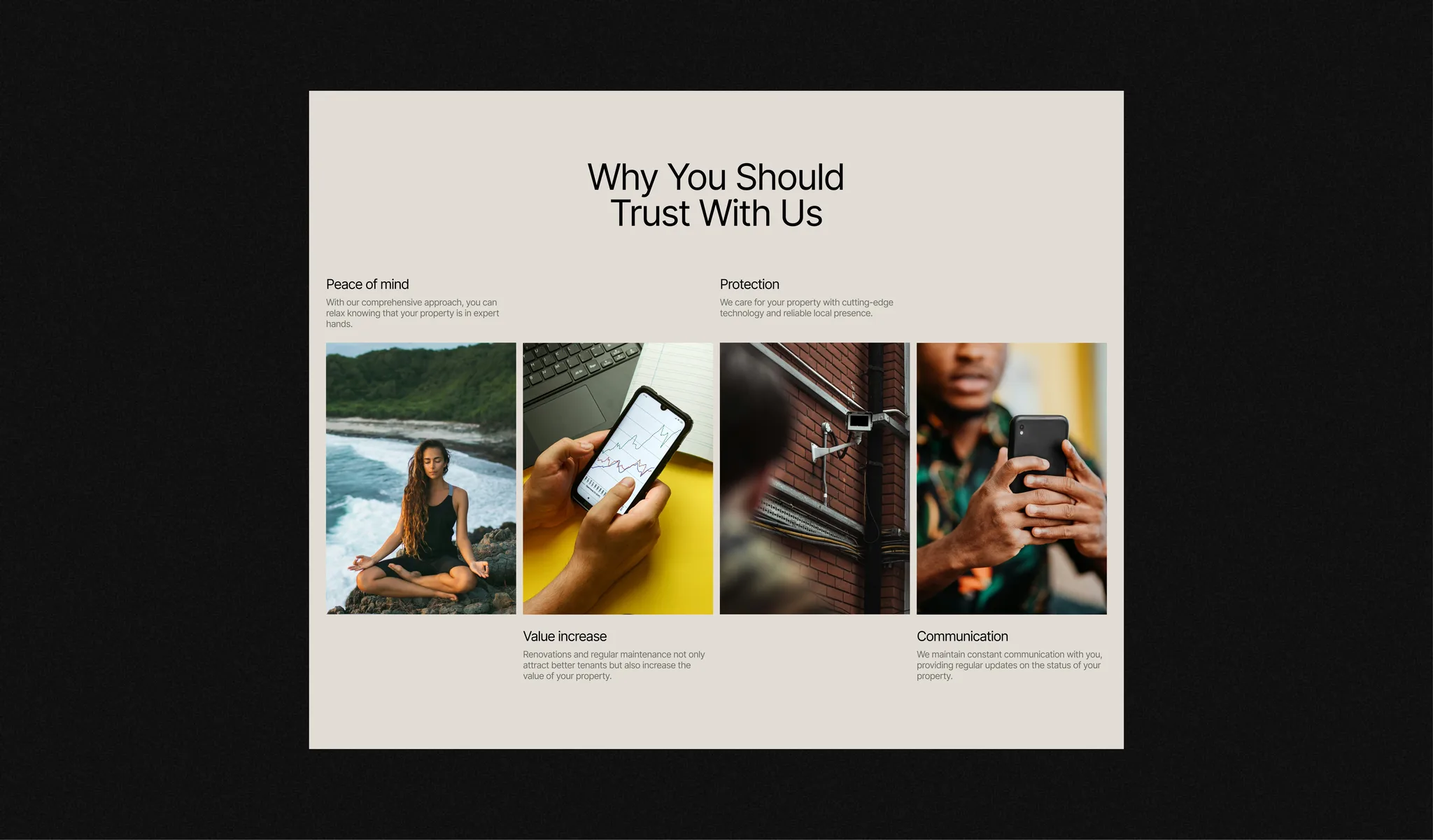
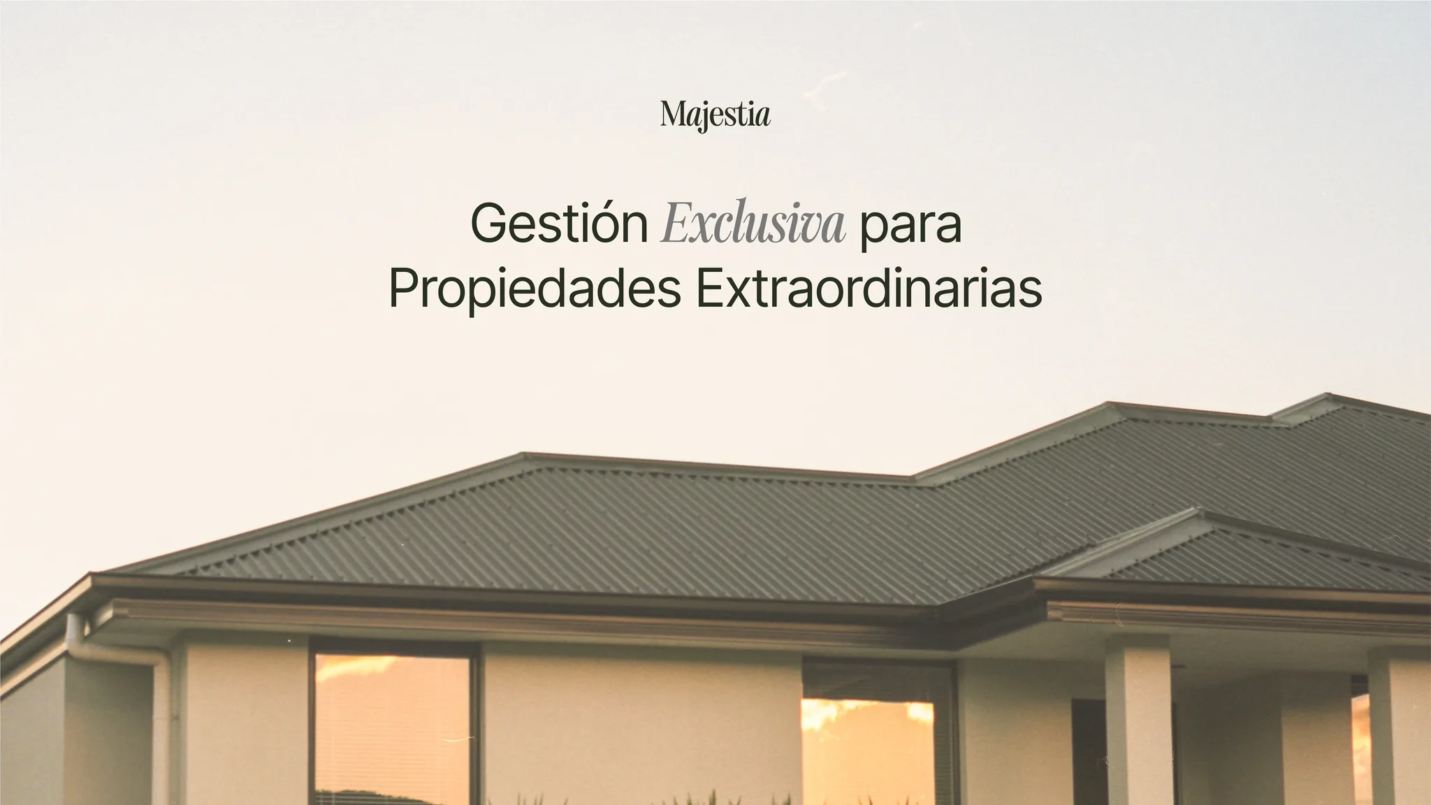
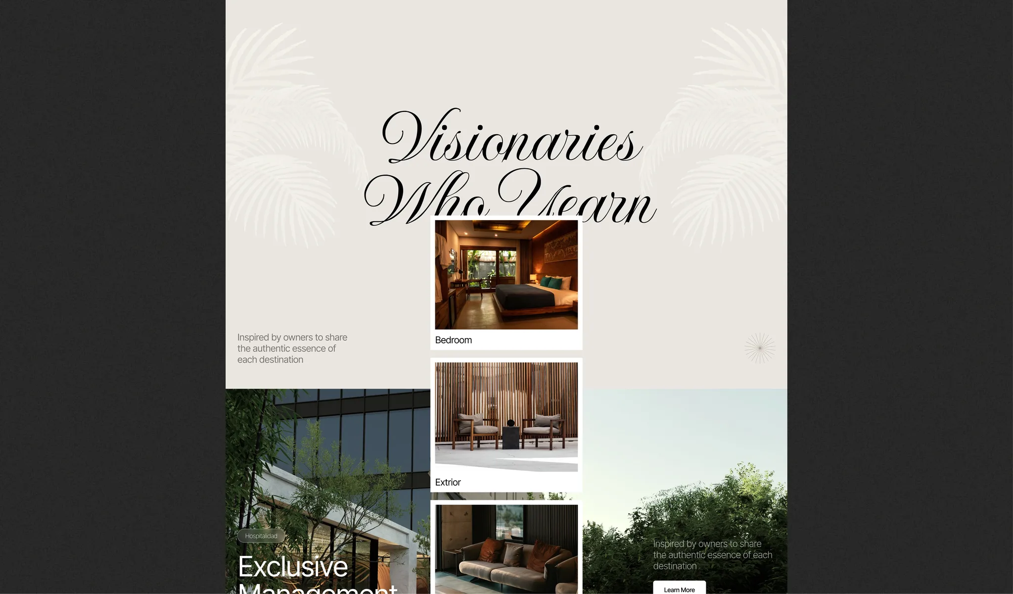
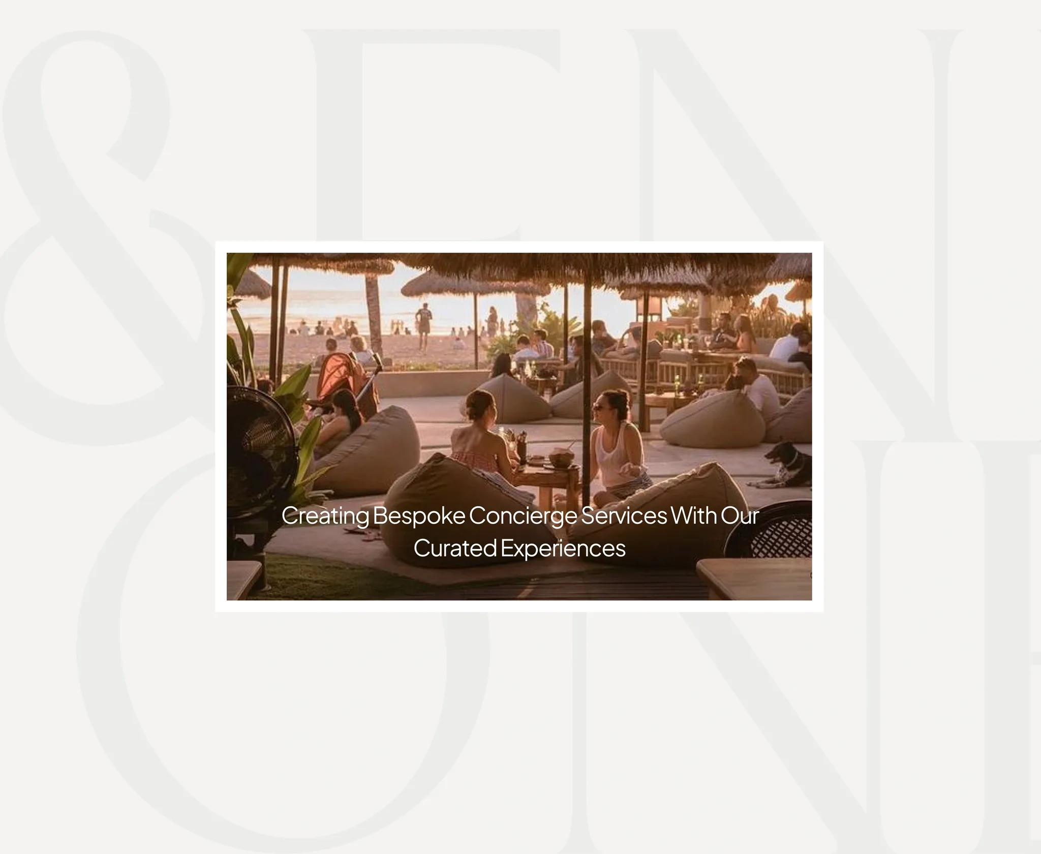
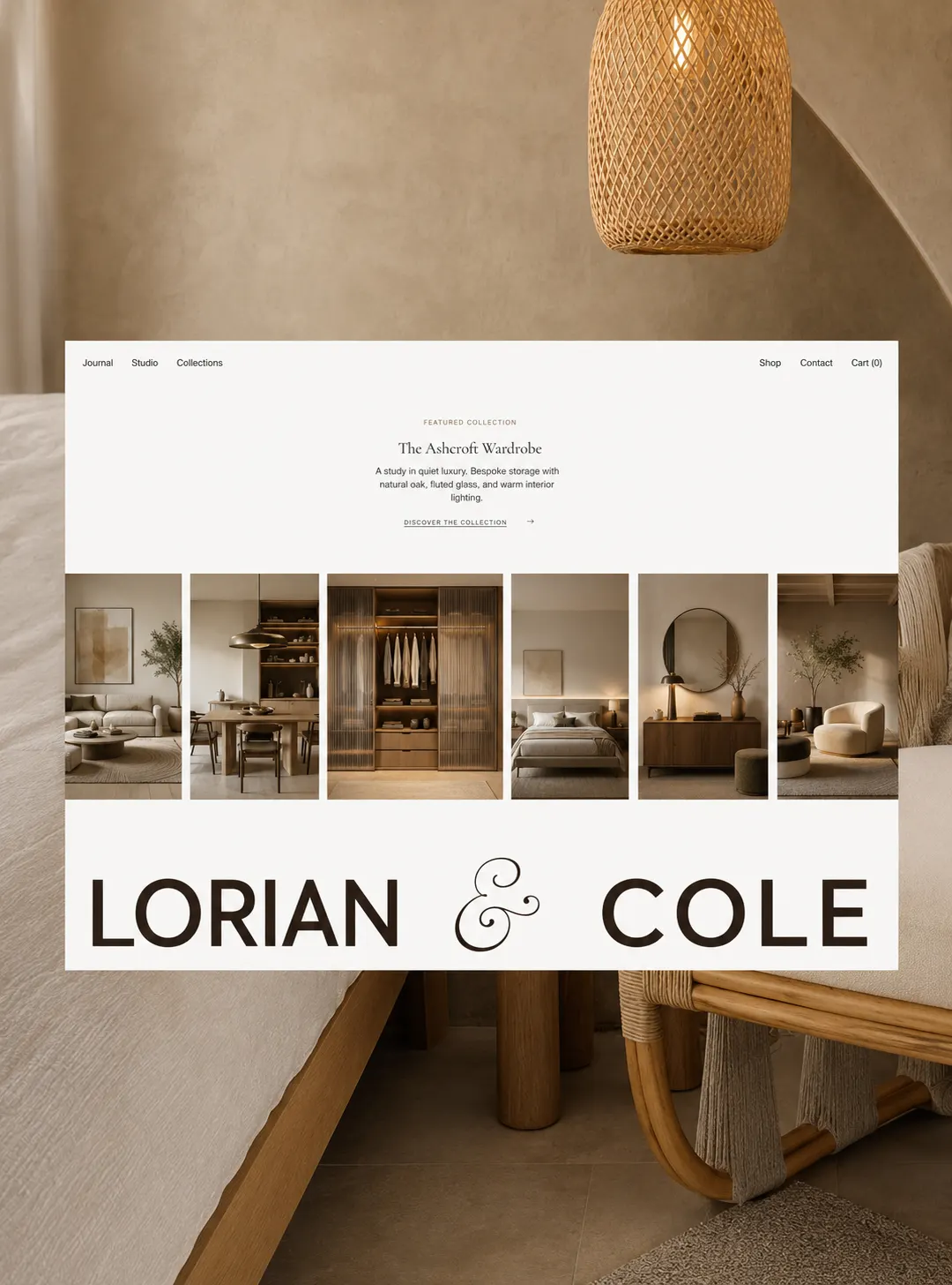
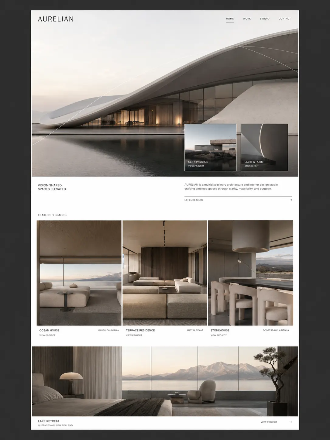
Most heritage brands lean on serif typography, gold and crests. We did the opposite — a single sans, a restrained palette, and photography that treats the houses as living rooms rather than monuments. The result feels present, not preserved.